Michael Jacksons – This Is It

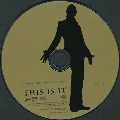
Michael Jacksons Digipak has a house style on the front of the Digipak he uses 2 main colours, red and a greyish white. On the front he does not use a lot of space for text he keeps it to a minimal and has a silhouette of his body shape with another image within it this is the same as the back of the Digipak. He uses the same 2 main colours Red and grey and still uses a silhouette with a image init and both of these images are mostly red. The writing on both the front and back are the same black font, on the back he has the main conventions a barcode, music producer, thanks and track listings. Inside the Digipak the CD is gold which is using another colour but has kept to a 3 colour house style and again a silhouette is used on the disc but this time with no image in it.
A clear font is used, appropriate sizes for the text and images, a usable house style is used the texts are well placed, the 3 colour ruled is used wisely keeping the colours basic. There are no stretched images no layer styles or unnecessary effects.

This advert relates to the album digpak it uses the same house style using the same colours red and greyish white, it also uses the same picture as the front of the album cover, at the top of the advert it has some text using the same font as the album cover. at the bottom of the advert the it has some producer logos and some writing explaing the companys who are presenting the album and some acknowledgment of who helped out with the album
Katy Perry - Teenage Dream

 Katy perrys digipak is very simple yet very brave. It has a simple house style a black background inside with pictures of her nearly half naked, which appeals to the males more then most females. In the pictures of katy she is wearing the same costume in the inside with different shots, a medium close up and a sort of establishing shot. The CD itself relates to the album as a chart song on the album is a video about everything made of sweets and the CD . Altogether the house style inside is easy. The front cover is a very high quality image of katy perry laying on some clouds which does appear in one of her music videos on her album.
Notorious B.I.G - Ready to die album

This album cover is very very simple it is a plain white background and a toddler on the front, very simple colours white, black and red. the back of the album has the same house style a white background with the B.I.G on it using 2 black males on the album is a good contrast to the white background, also on the back they have used red writing aswell this stands out well. also they have the barcode producers name and copyright info at the bottom and on the front as biggie uses explicit lyrics the warning sign is on the front .